Kashoo 2.0 Web
Making financial information understandable and usable.
OVERVIEW
Contractors, freelancers and digital professionals are just a few that make up a large segment of truly small businesses. These truly small businesses tend to have either less than five employees in their company or even only just themselves. Therefore, finding the right tools to match their business size can be difficult as bookkeeping is not one-size-fits-all.
As the UX Lead of Kashoo 2.0, I strove to design an experience that is simultaneously simple and intuitive, yet powerful. I collaborated closely with the development team and project manager to launch the project in Nov 2019 and have gone through continuous refinements from user feedback and designing new features to be released.
ROLE & DURATION
Lead UX Designer
Product thinking, Visual design, Prototyping, Wireframing, User Research, Testing, Minor front-end developer
Tools: Sketch, Figma, HTML/CSS, Github, JIRA/Confluence
Mar 2019 - May 2021
The Problem
The average small business owner spends 6.8 hours a week on their finances and even then, these small business owners may not be using the correct tool for them. Small businesses often need different resources and tools than their medium-sized business counterparts to succeed. It’s not a one-size-fits-all solution.
BACKGROUND
Kashoo Classic
Not until late 2019, Kashoo had one product, Kashoo Classic. Although It is a great tool for accountants working in small to medium-sized businesses, the product is more than nine years old and needed some revamping as it’s not an easy interface to navigate through for a first-time user.
Kashoo Classic
USER FEEDBACK
Feedback from Existing Users on Kashoo Classic
Prior to me joining, the team had been gathering feedback from existing users through Intercom, surveys and cancellation forms on how to build a new and improved Kashoo 2.0 to better serve our truly small business owners.
Here are a few comments for improvements for a new version Kashoo.
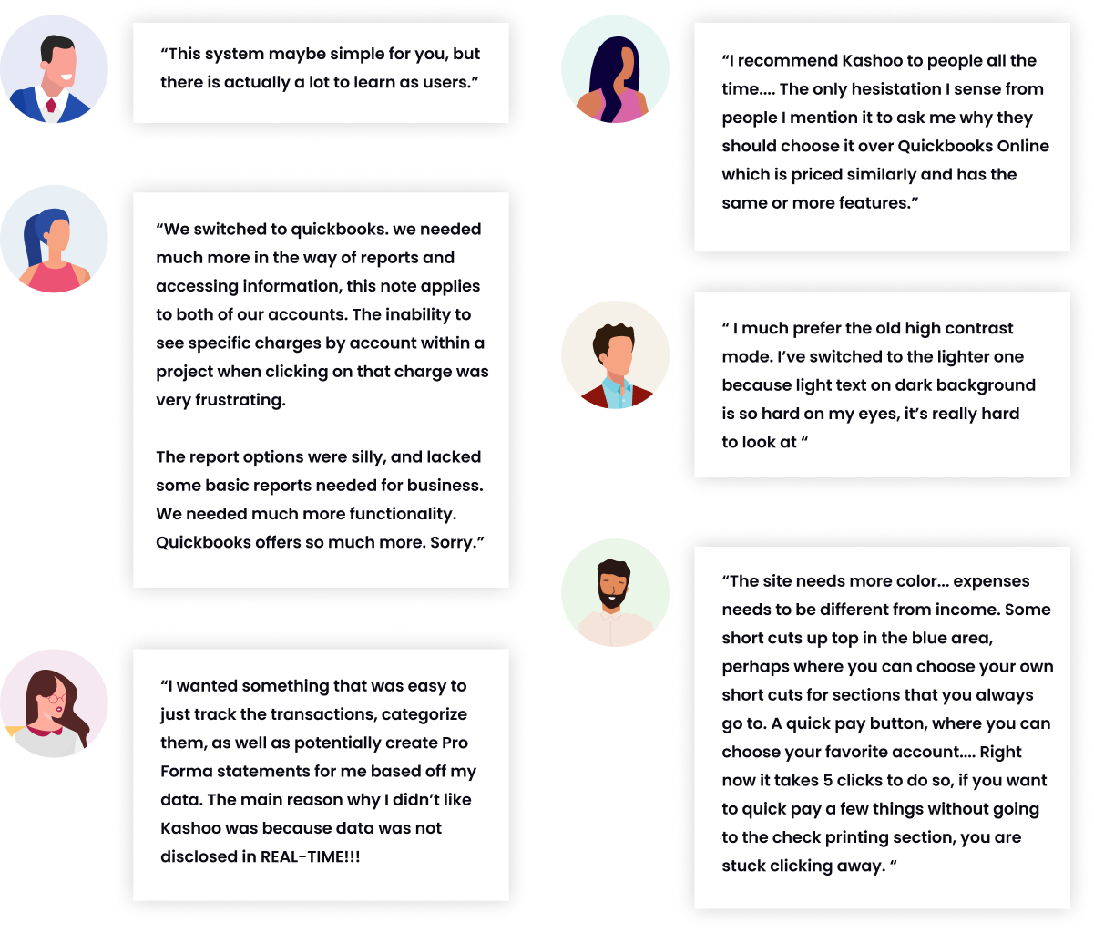
Overall Issues - Kashoo Classic
- When the user first enters into the software there is no sense of where to start.
- Too much shown on each page. Hard to focus.
- Some features that only accountants understand but a regular user may not. Ex. Taxes
- Targetted towards accountants only so small business owners with little knowledge of accounting wouldn’t find the software intuitive to navigate through.
- Too much flexibilities. Unless the user knows what they’re doing is correct, it could affect what they submit to the CRA/IRS.
- All pages look alike making it confusing to the user making it easy to accidentally input the wrong type of data into the system.
- Where to connect bank isn’t clear.
*Problem because users who connect to the bank tend to convert to paid subscribers than those who don’t.
THE NEW
Kashoo 2.0
Automating redundant bookkeeping tasks for small business owners to help them focus on running their business.
CONTEXT
What’s special about Kashoo 2.0?
Using machine learning, Kashoo categorizes and matches recorded expenses with bank and credit card transactions, and provides accurate, complete, and real-time reports in one-click. Kashoo also provides OCR and receipt-matching just having the user simply attaching image of a receipt in the Inbox and the system will automatically match it to a transaction. By using Kashoo 2.0, it’ll reduce amount of mistakes made and reduce the amount of time needed dealing with the finances.
Early Concept
Prior to my start with Kashoo, an external design agency was hired to take on Kashoo 2.0 visually and experience-wise.
Few Issues I noticed:
- When the user first enters into the software there is no sense of where to start.
- Too much shown on each page. Hard to focus.
- Some features that only accountants understand but a regular user may not. Ex. Taxes
- Targetted towards accountants only so small business owners with little knowledge of accounting wouldn’t find the software intuitive to navigate through.
PROCESS
Taking a step back...
Initially, I was mainly tasked to rework the UI visually to make tweaks of what I thought could improve. However, I took a step back and analyzed the current interface more. I asked myself, “ If the interface was better visually, will it solve the main issue? Is the current UI solving the main issue in Kashoo Classic? Will users understand what to do?”
Just because an interface is visually appealing doesn’t mean the experience is good.
As the sole designer and a new face in the company, I decided to map the user journey in a perspective of someone who has used an accounting software before while making the UI more visually appealing and understandable.
Kashoo 2.0 Web User Flow
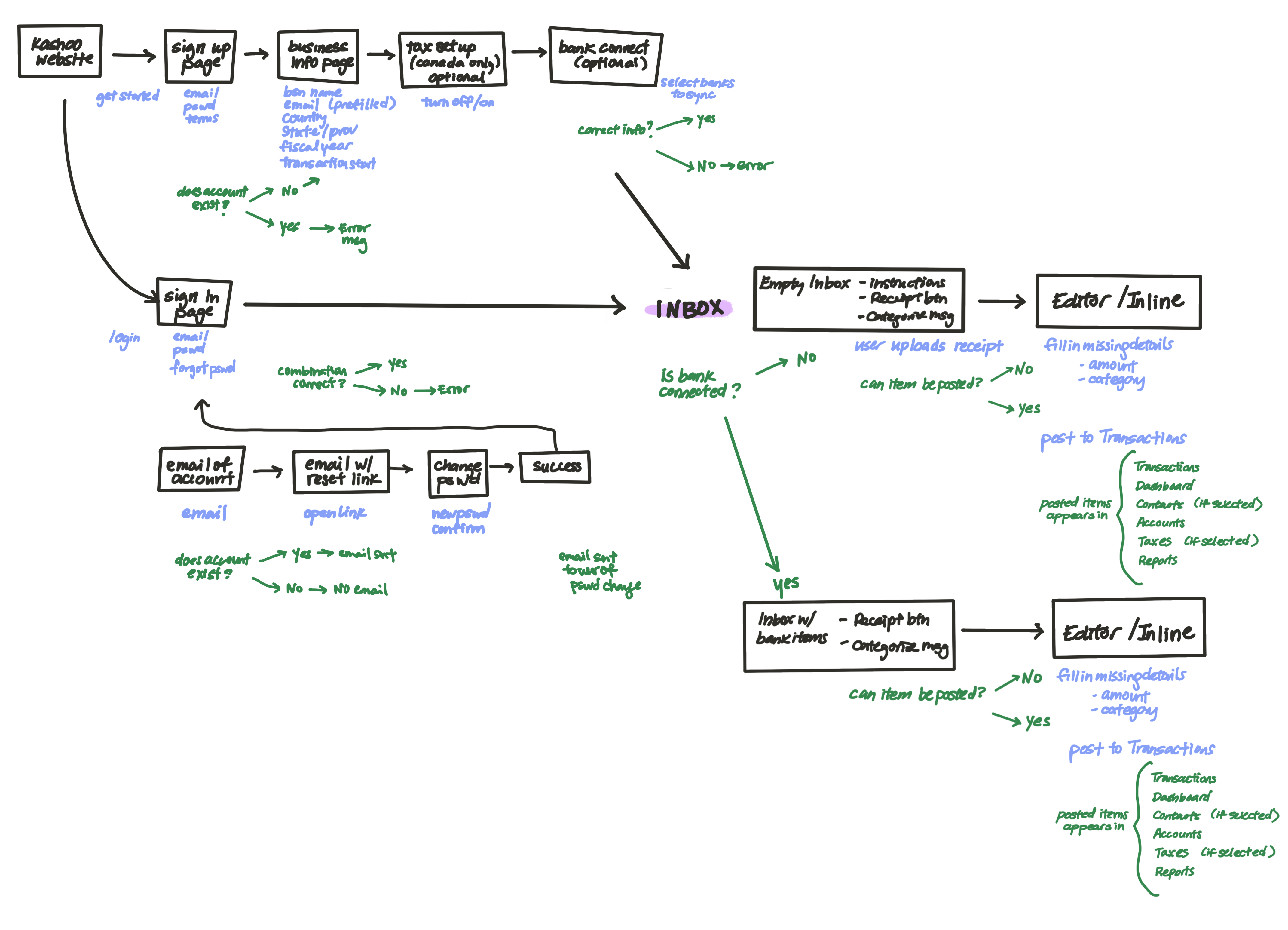
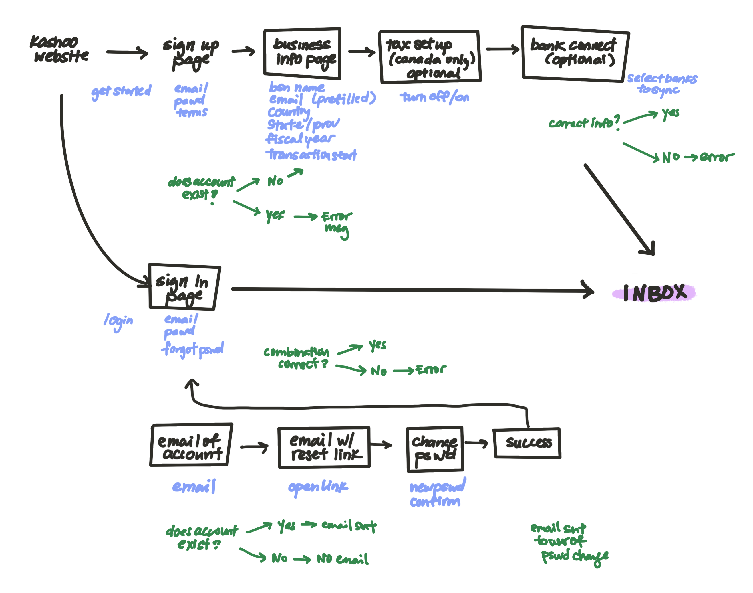
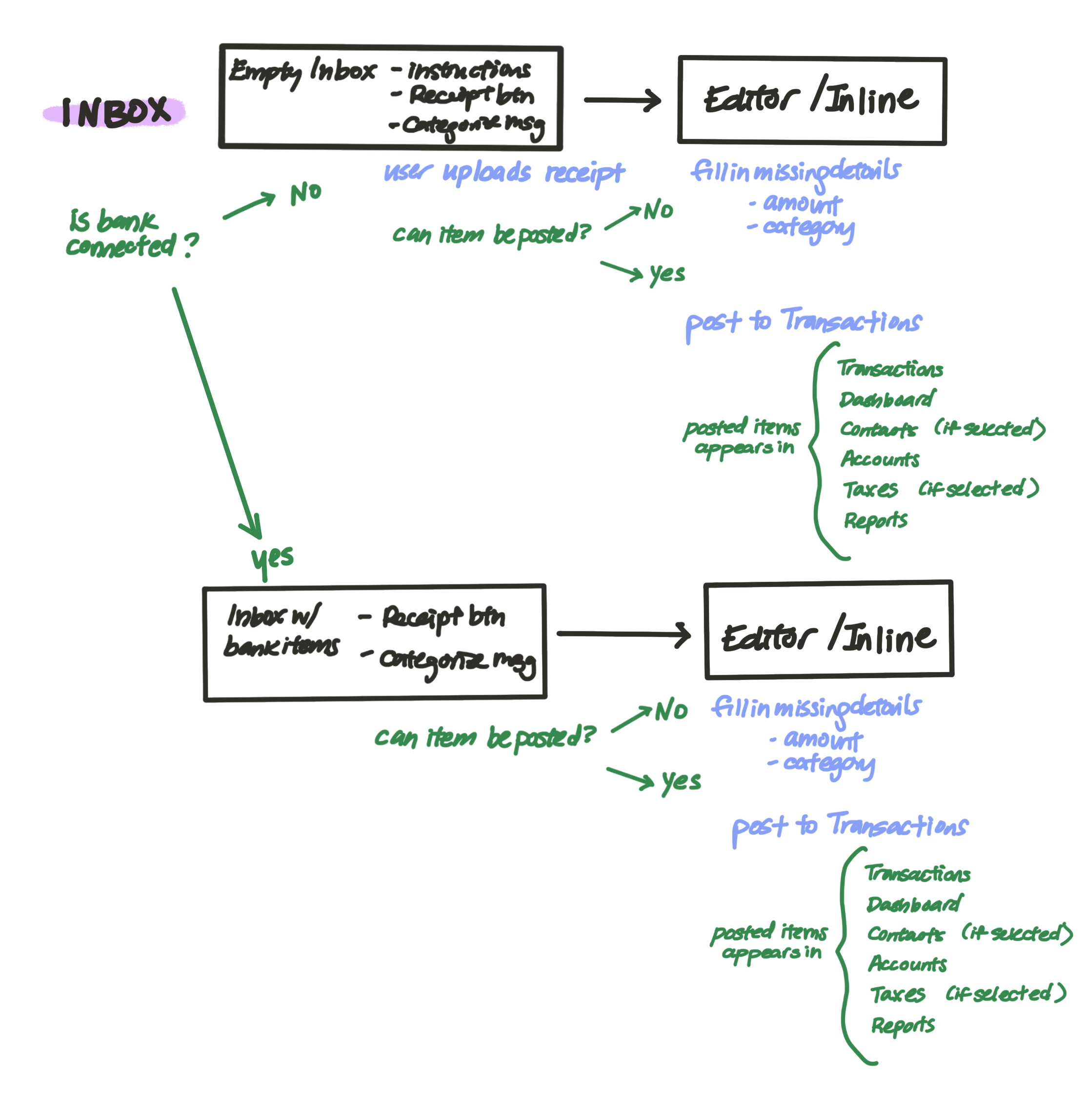
High Level User Journey
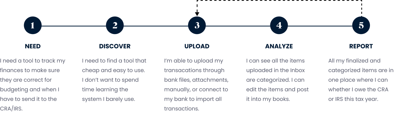
Some wireframes of design layouts
FINAL PRODUCT
Branding
As the sole designer, the team trusted my judgement and luckily everyone was flexible with me changing the font and adjusting the colours in the interface.
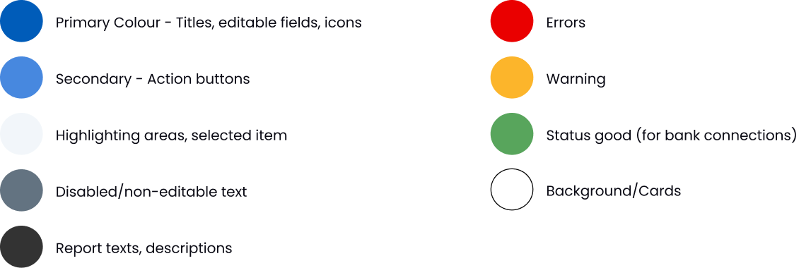
Colour
The first thing I noticed in the initial version was that there were multiple different types of blues (~13). The now present UI consists of 1 main dark blue (the same as the one in the logo which was not used in the interface at all), a secondary blue for actions, a couple variations of grays and red for errors. Each colour serves it’s own purpose.
INITIAL COLOURS (BEFORE)

CONSOLIDATED COLOURS (AFTER)
Font
The initial font of the webapp was Nunito. Although it’s a Google webfont, I felt that it didn't make the interface look clean. The slight curve in the lettering made it hard to read when the text was bolded like in the sidebar. The logo font and the interface font were different and I felt the two should be somewhat similar, that is why I chose Proxima Nova. It’s more of a straight font which made the UI more clean and easier to read.
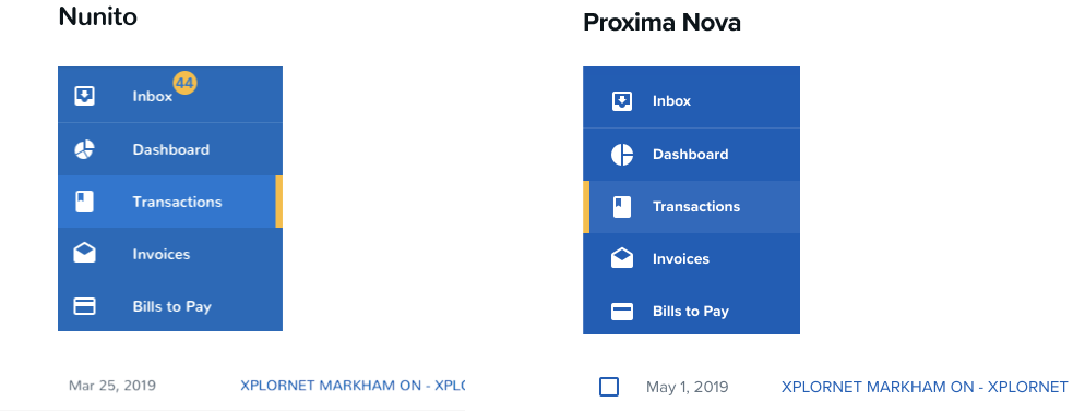
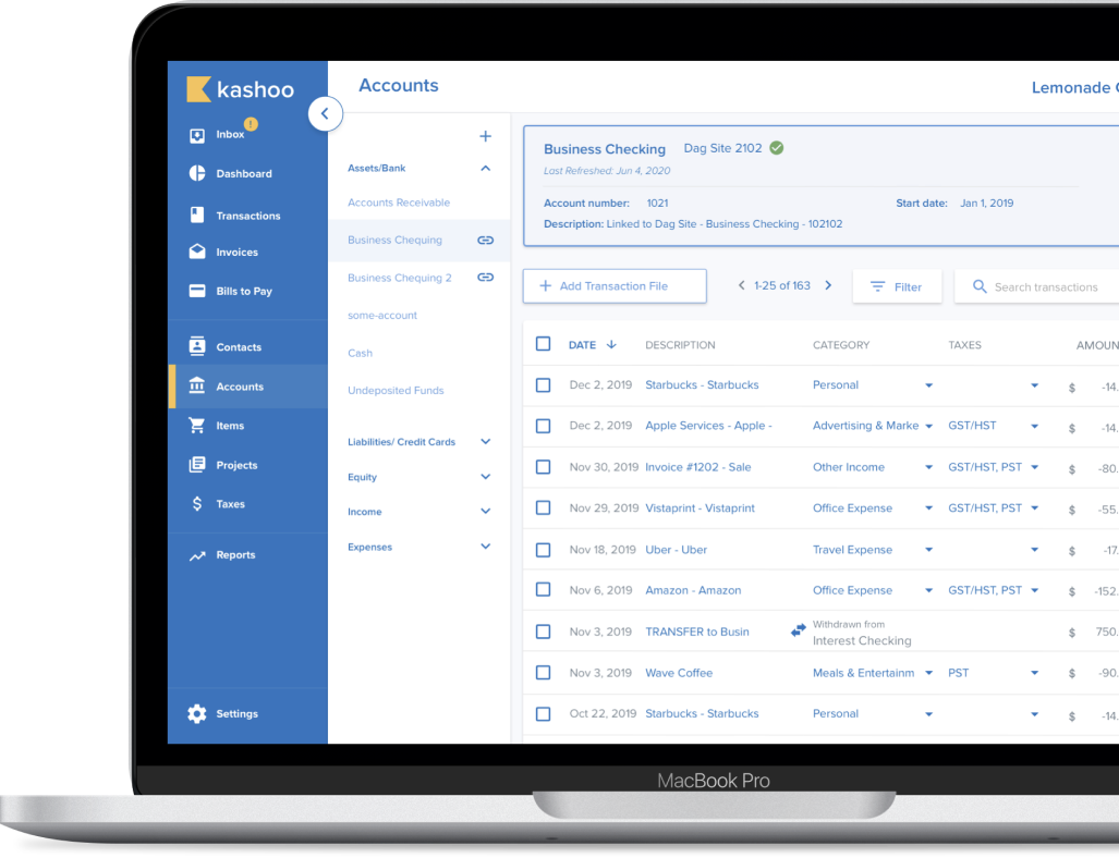
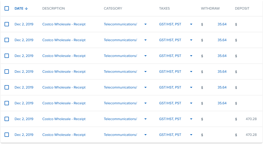
Table Layout
As majority of the webapp consists of tables, I decided to tackle the layouts of the tables (Inbox, Transactions, Contacts, Accounts).
For the initial version of Kashoo 2.0, the table layouts were too spaced out. This made the interface look messy and hard to read. There was a lot of unneccessary spaces between columns.
In the redesign, I chose to use a 24 column grid system to maximize the horizontal spacing.
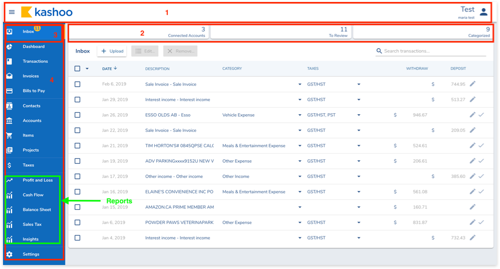
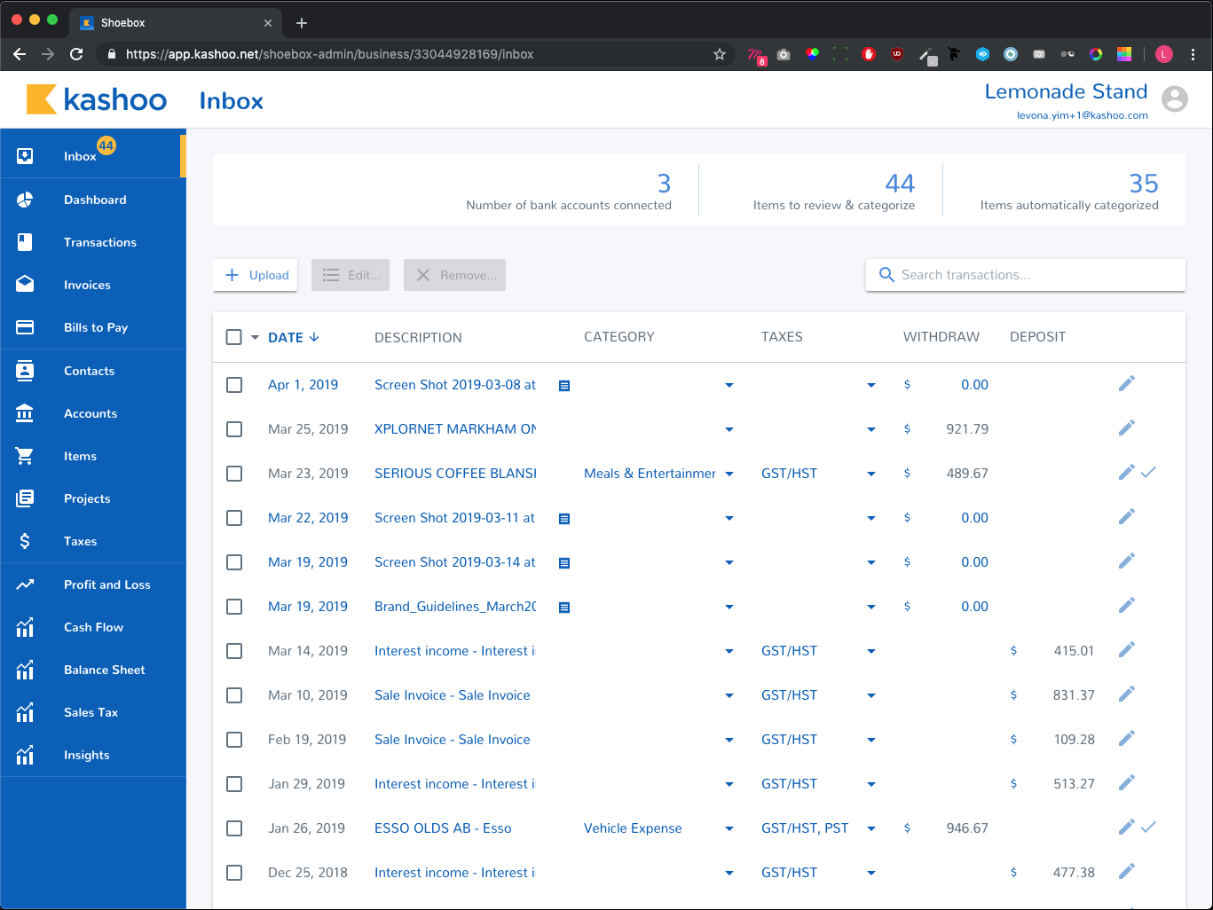
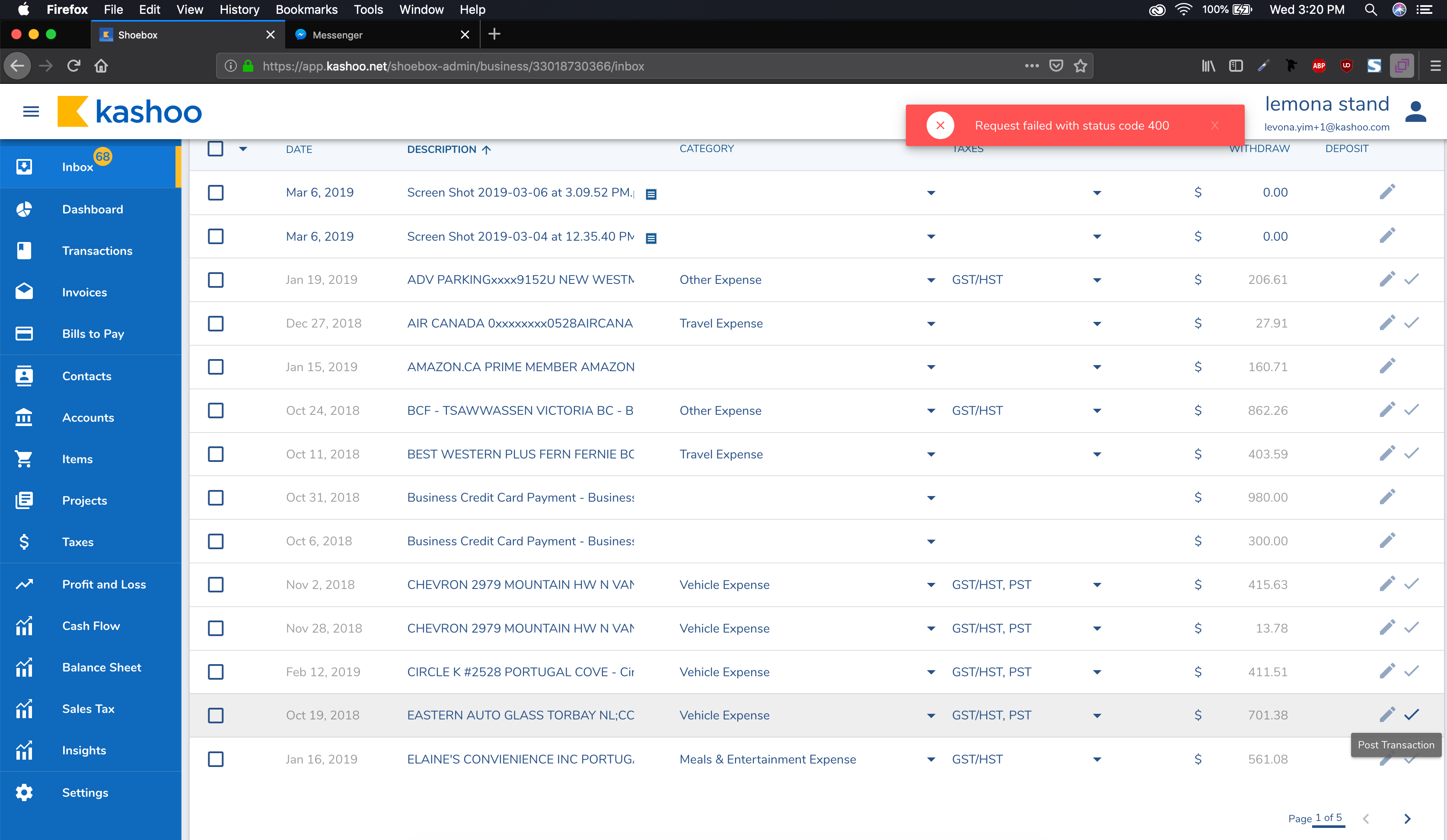
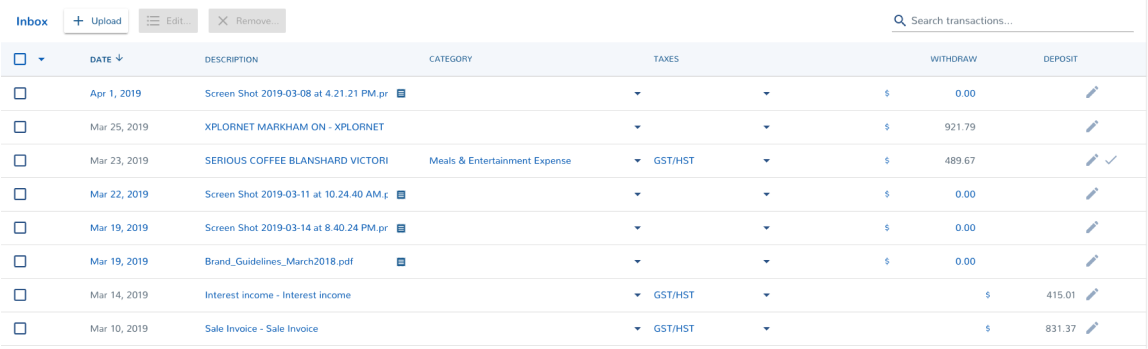
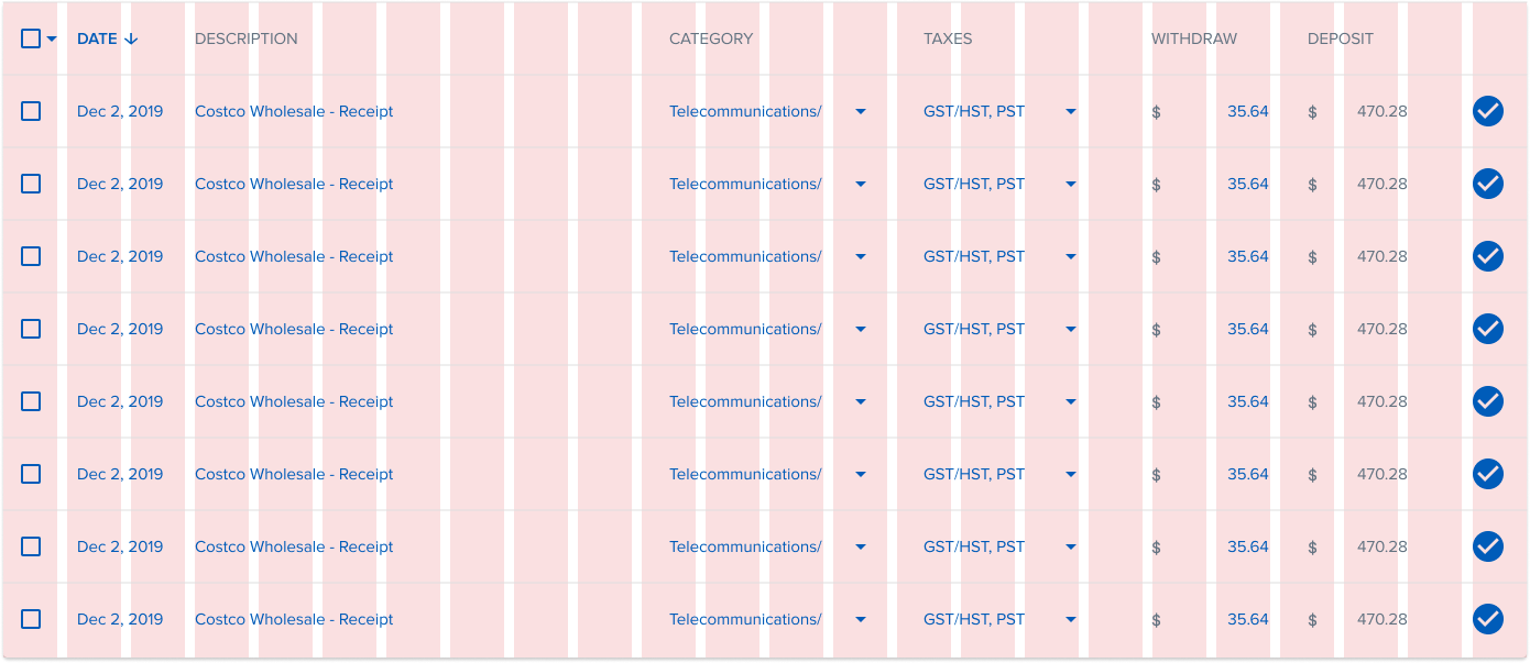
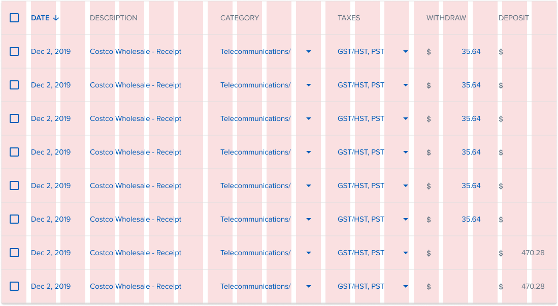
INBOX TABLE
The initial Inbox layout had too much spacing on sides of columns which made the table hard to read. For the redesign, I chose to use a 24 grid system to utilize the space better. For example, there isn't any extra spacing when the columns fixed in size such as dates and checkboxes. This gives extra room for descriptions.
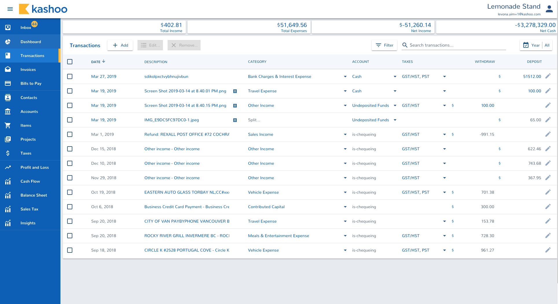
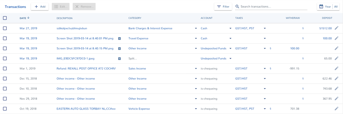
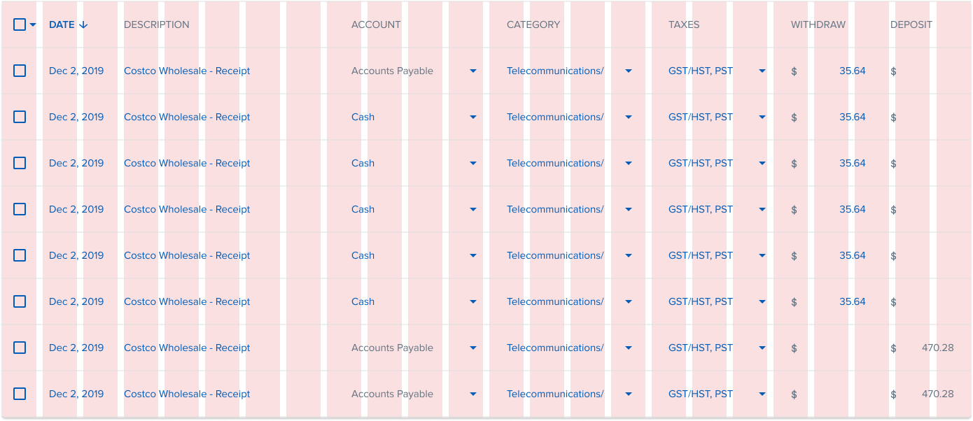
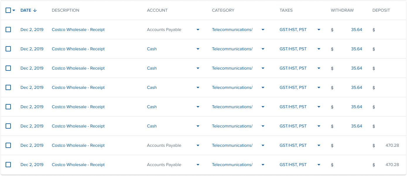
TRANSACTION TABLE
For the initial Transaction table, it was the same as the Inbox, the old table had too much spacing on columns. The Transaction table has an extra Account column therefore utitlizing the horizontal spacing is important. The new Transaction table uses a 24 column grid like the Inbox with a shorter Description column
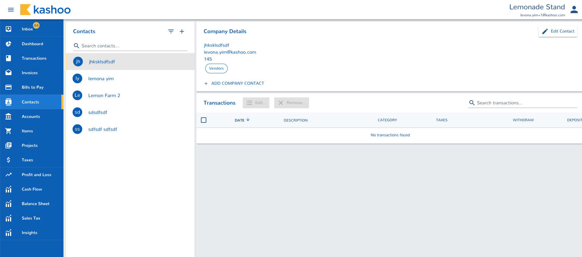
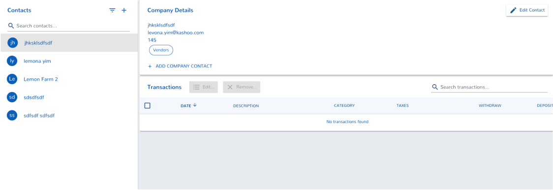
CONTACTS/ACCOUNTS TABLE
For pages such as Accounts and Contacts, there was a submenu to the side. In the redesign, I decided to minimize the width of the submenu more to give room to the tables and used the grid system to better utitlize the space.
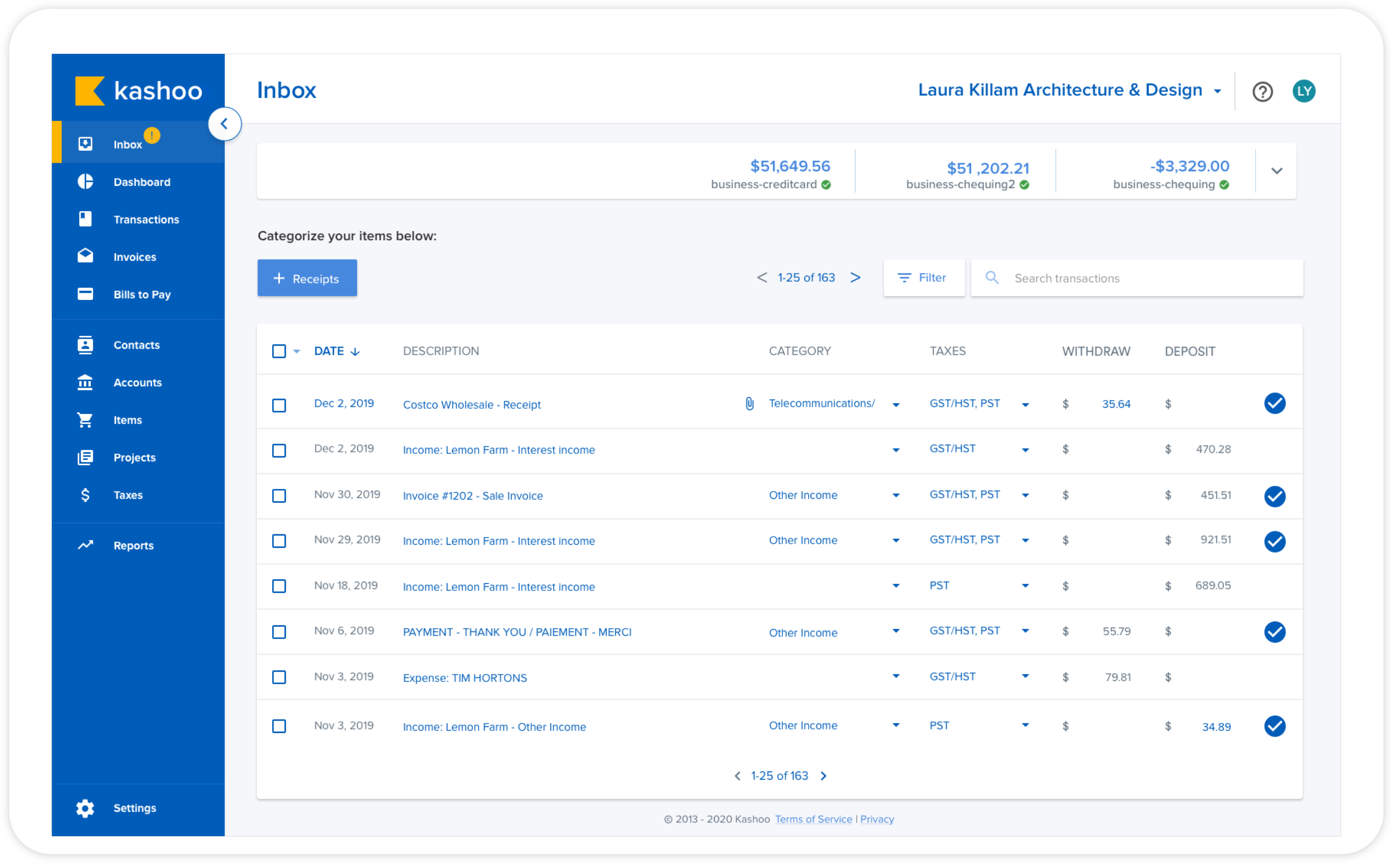
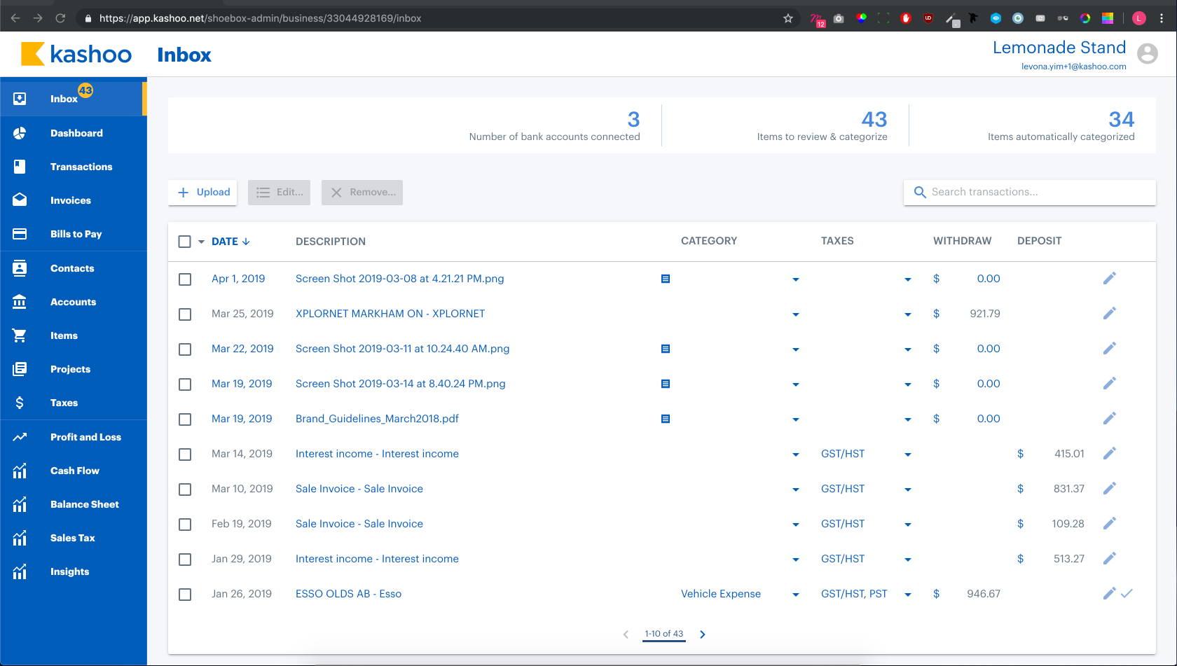
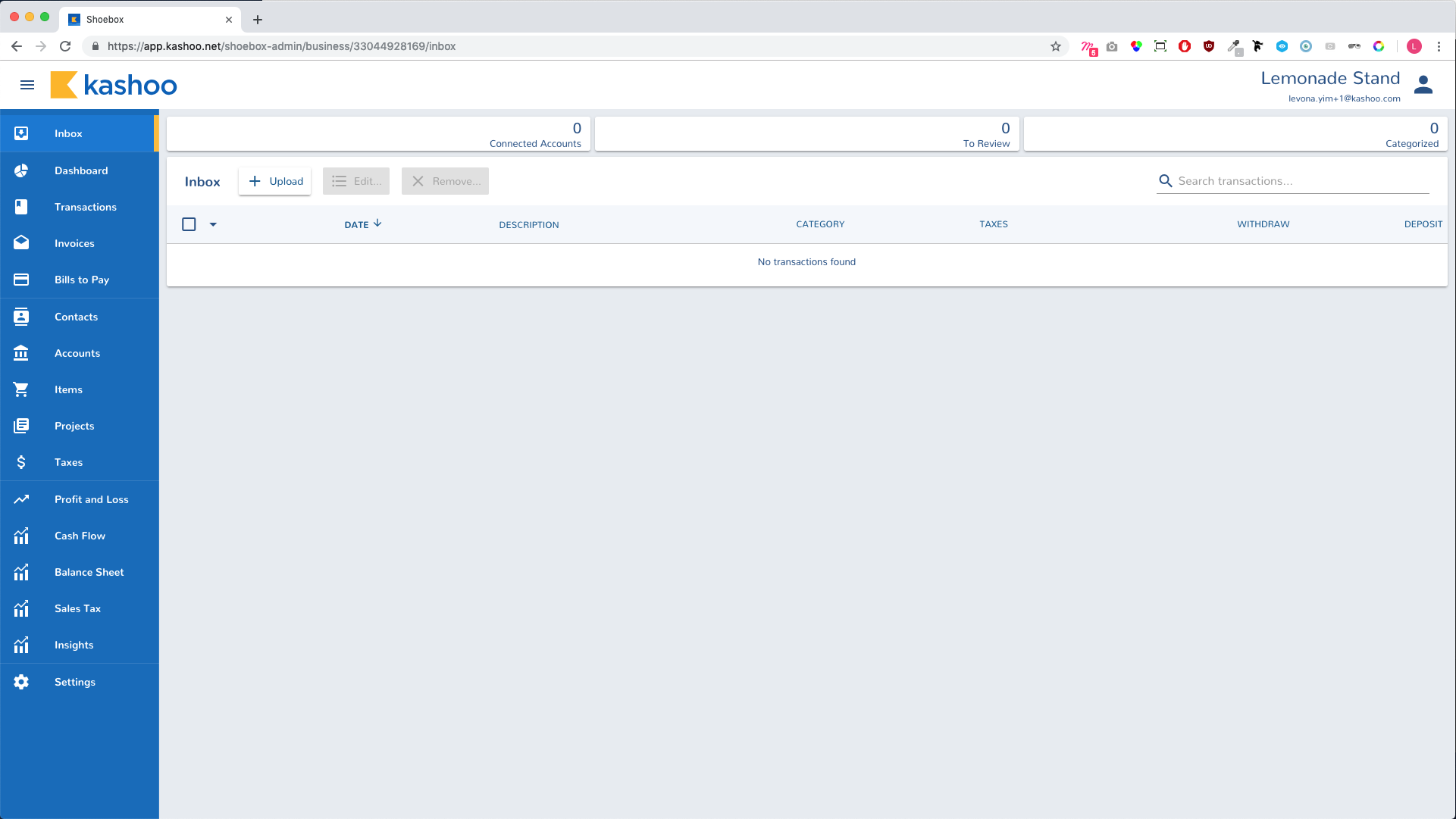
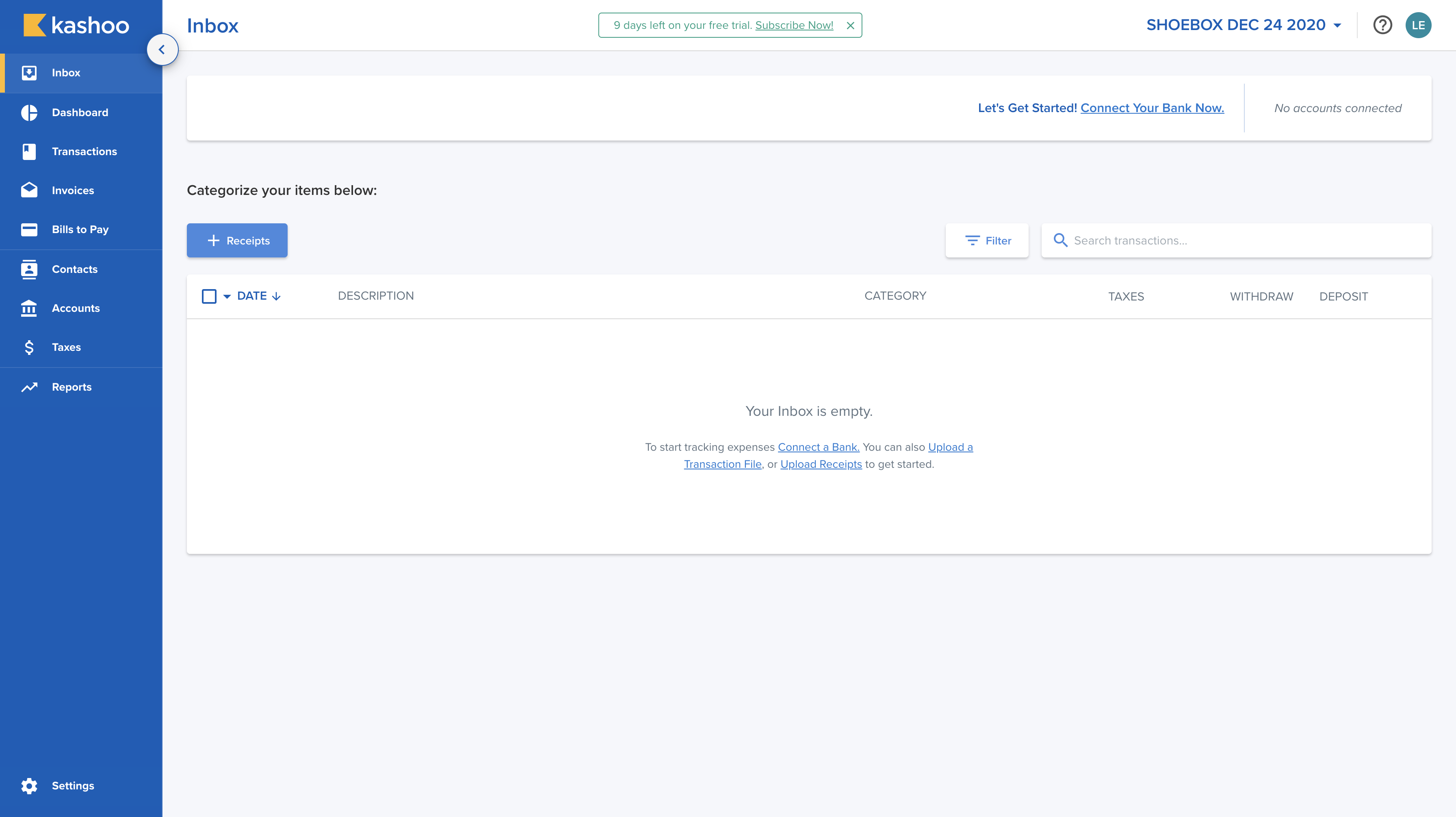
Inbox
As the Inbox page is the first impression to users, I needed to make sure that in all scenarios whether a user connects a bank or not knows what to do without it being to overwhelming.
FIRST TIME USERS NO BANK CONNECTED
We know that not all users tend to connect their banks to system until they trust the system enough. With Kashoo, users aren’t needed to connect their banks to the system. However do recommend users to connect their bank for a quicker and accurate process. Also, from our analytics, we learned that when a user connects their bank to the system, they are 4 times more likely to subscribe.
When the user enters into the webapp and no active bank is connected, we’ve provide a few wayfindings to get started:
- Instructions in the middle of the empty inbox of what the user can do to get started (connect to a bank, uploading a bank file, or uploading a receipt).
- “Categorize your items below” header and a “+ Receipt” button on the mid-left lets the user know their task on the page after an item has been uploaded.
- Top bar - When there’s no active bank connected, a message is shown to promote connecting a bank.
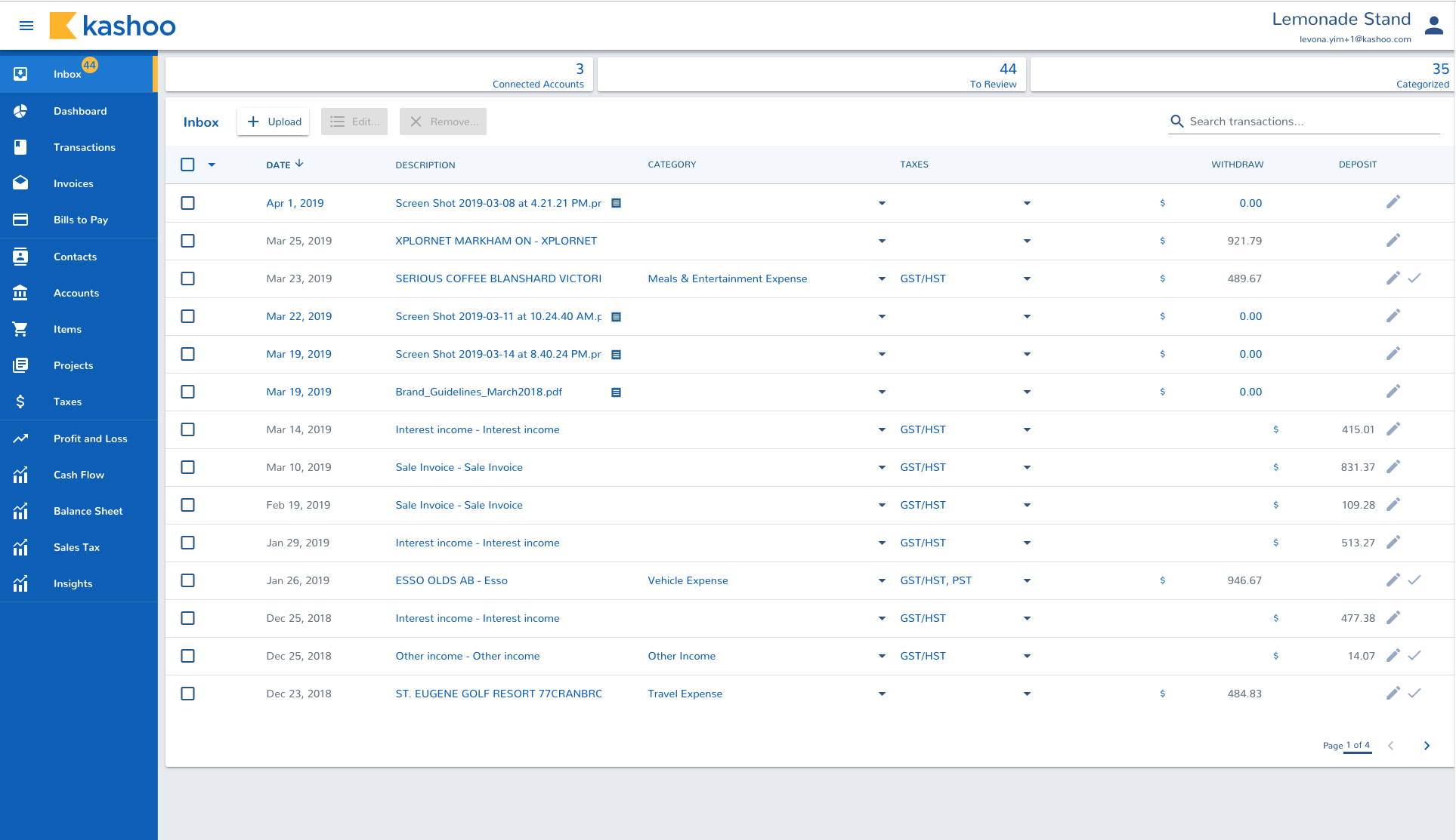
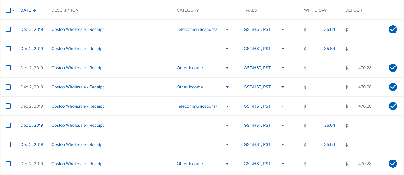
INLINE EDITING
Inline editing once there are line items in the table (gray for non-editable, blue for editable)
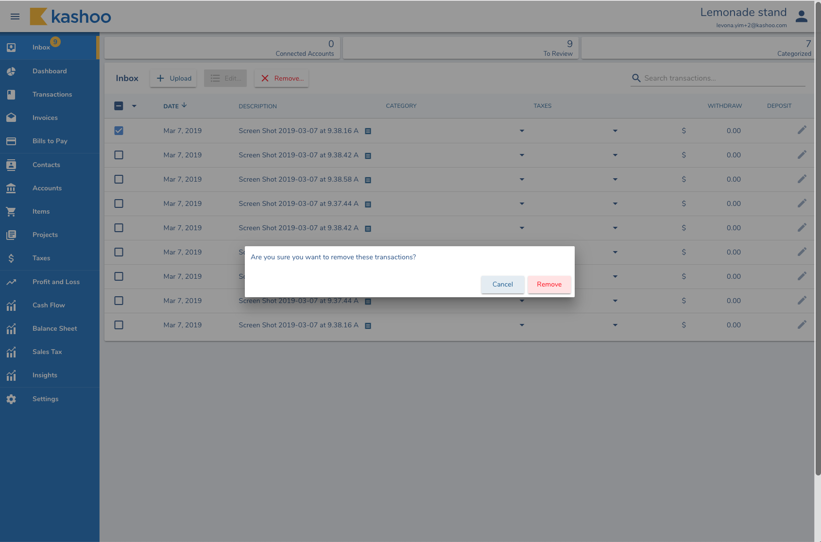
BULK EDITING
When a user selects multiple like items, they can edit the items as a a group instead of going to each individual item to make changes.
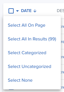
SMART SELECTION
Another feature added within the selection tool is depending on the type of item selected, different icons app. We chose to hide the buttons that aren’t functionable when selected to minimize confusion. The action icons options are Edit, Post, Delete, Undo.

We’ve included a smart selection in the Inbox table. where users can select all on the page they’re currently viewing, all results, only the categorized, all uncategorized or unselect all.
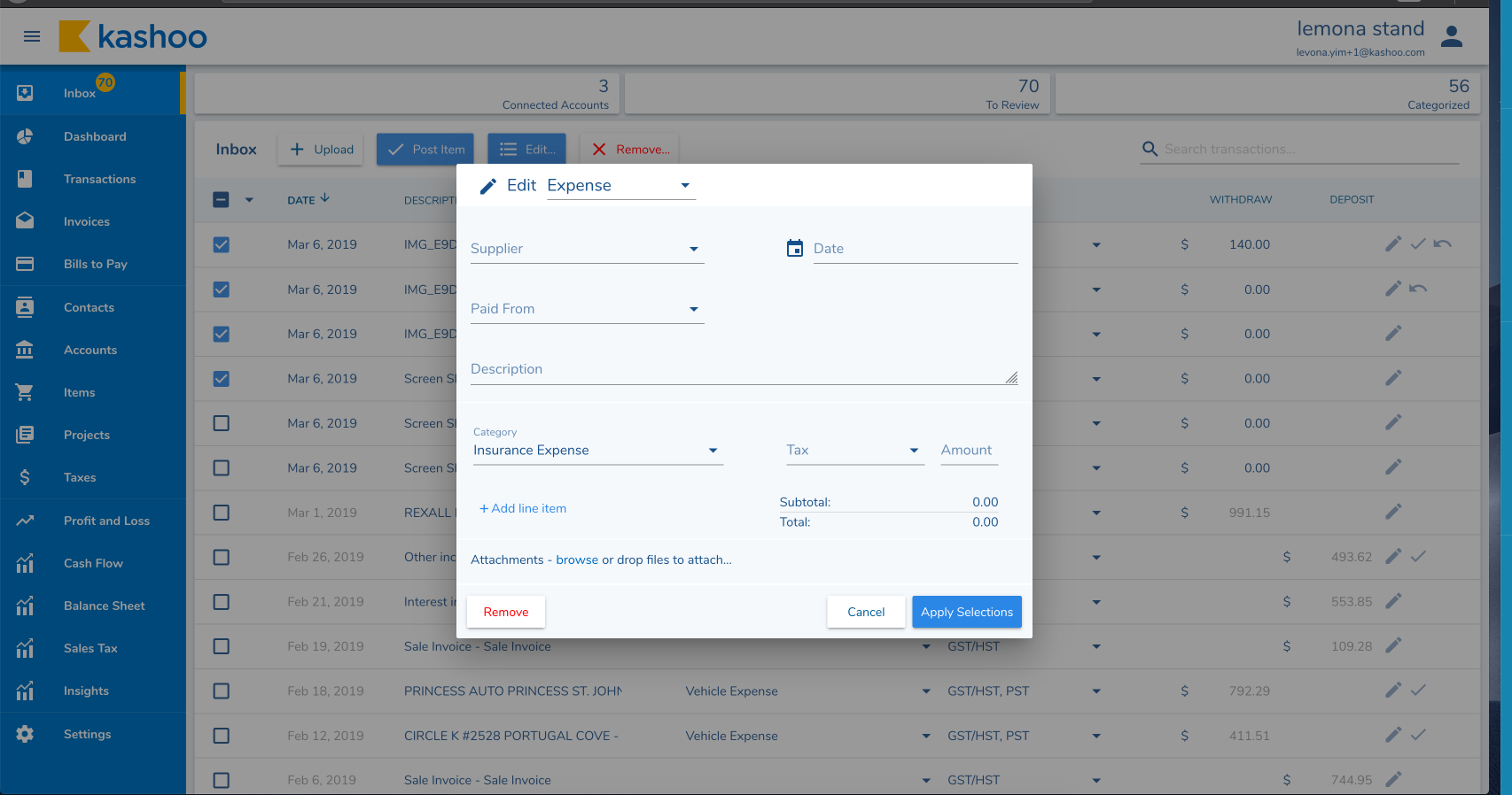
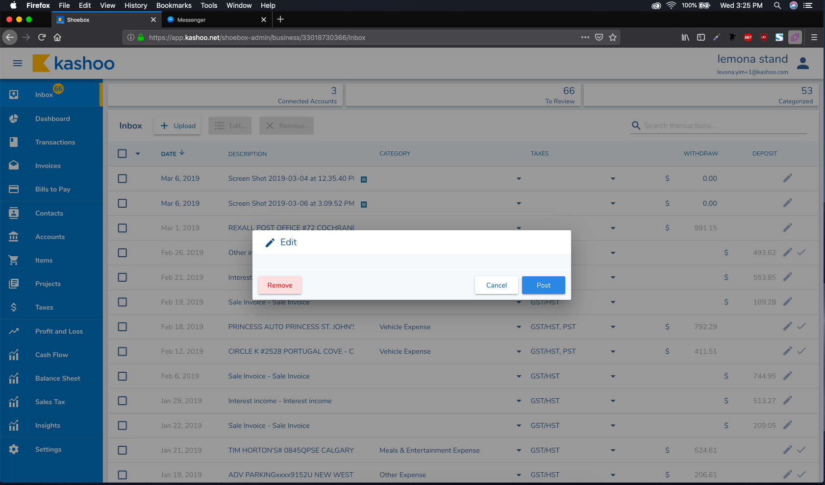
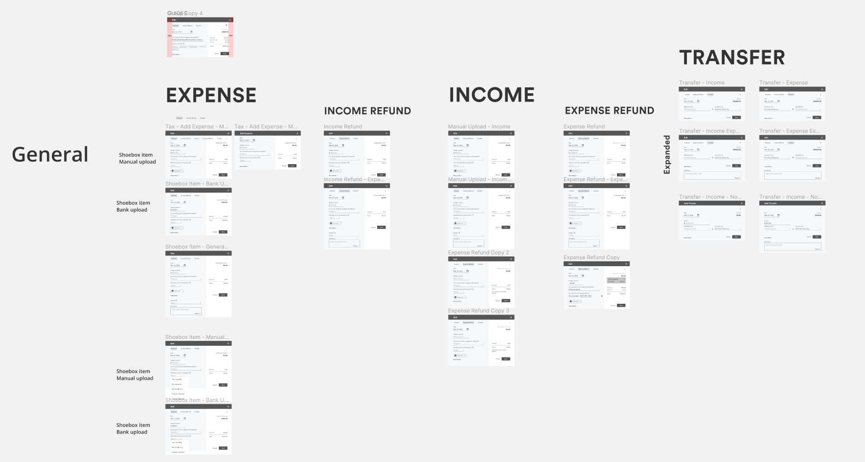
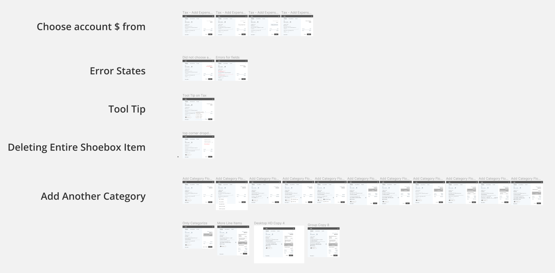
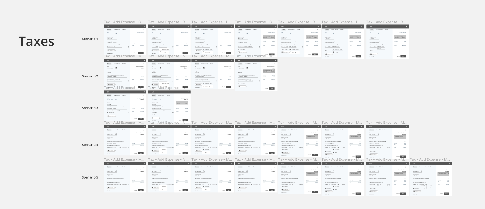
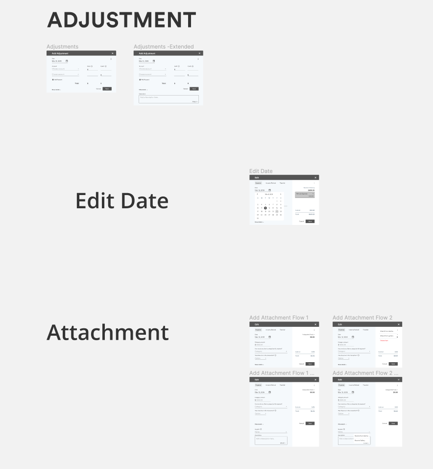
Editor Modals
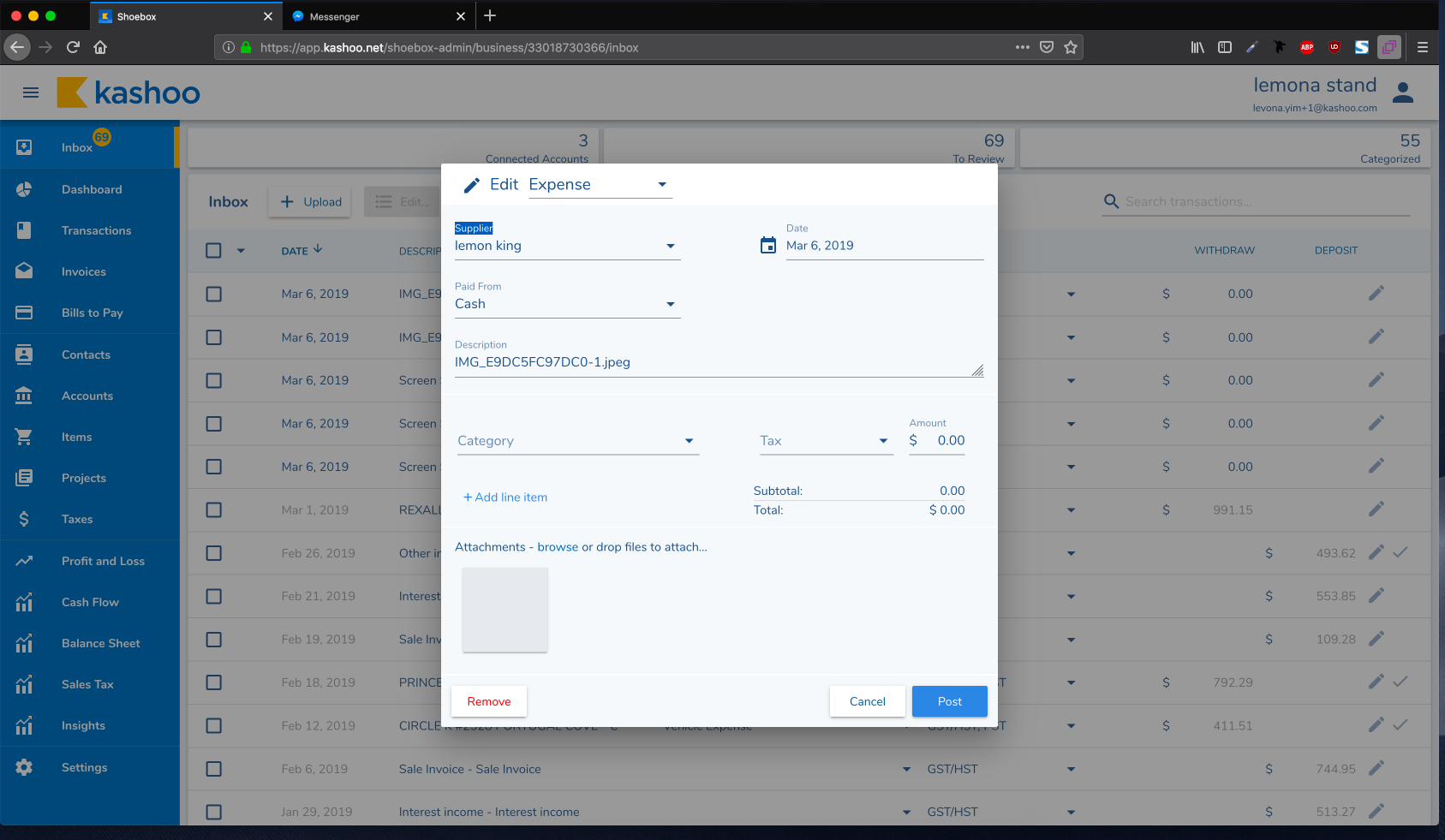
ISSUES WITH THE INITIAL DESIGN
The Editor modale was another big task for me to tackle when I first joined the team. Overall, the layout was messy. There wasn’t a clear hierarchy in how the information was to be read or filled. Also, changing the type of item it was (expense, income, refund) wasn’t noticeable even though there was a dropdown at the top.
MY TAKE ON REDESIGNING
For the redesign, I decided to give all modals a clear header. I also changed the layout with a split view, one side for editing and the other for reading the totals.
- The layout was inspired by the ecommerce checkout layout where everything on the left is the details about the item while the right side is the total calculations.
- Just like the Inbox inline editing, if the input box is gray, they can’t change it. If it’s blue it’s editable
- The types can be changed easily on the top - inspired by Google Calendar in selecting the type of “event” it is.
- For selecting Tax, I chose to phrase it as a question rather having the user try to guess through a +/- sign.
- When the user has multiple items in a single receipt, this is referred to as “Splitting a transaction” or “Adding a line item”. When the user presses the link below, the existing item is formed into an “item” on the right. The user can edit the item by selecting the box itself.
FEEDBACK FROM STAFF TESTING
For the first iteration, I had the account on the right (above the total) but from multiple feedback from staff testing and beta users, all first time users wouldn’t notice that field. My reasoning for putting it on the right initially was that I thought it would overcrowd the left but it didn’t
Side Menu
In the initial design of the side menu, there was a hamburger menu to the left of the logo that was not noticeable. For the redesign of the interaction, I was inspired by the Confluence button being in the middle of the bar. It’s more noticeable to the users if they want to have more horizontal real estate. I also made the decision to use an arrow instead of a hamburger menu as it’s more intuitive to the user as the majority of the current users are a lot older (late 40’s to 60’s) and may not be used to relating certain icons from their phones to the web.
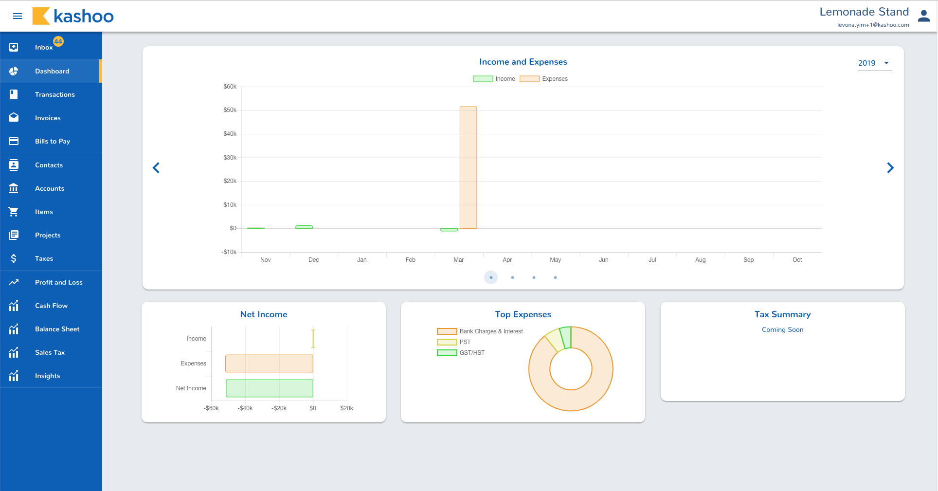
Dashboard
The main issue with this page was that it wasn’t on brand. I also chose colours to be differentiated even for the visually impaired. Initially I thought different colours could be easier but ended up leaning towards shades of blues and purple. This worked the best because the colours wouldn’t stand out too much nor would they blend in together.
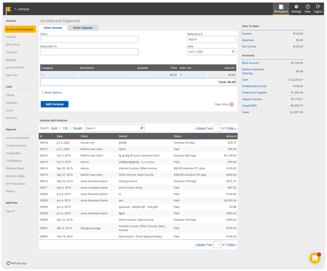
Invoices
For the Invoices and Bills to Pay pages, I initially thought to use the same layout as the main editor modales from the Inbox but after discussing with the team + the project manager, we decided it was best to make it slightly different as it needs to consist of a table section listing out all the invoices sent and it may confuse users of the likeness of the pages (which is a problem in current Kashoo Classic).
Reports
For the reports, this is where I got my hands dirty with code and did the styling for the reports displayed. Also with the new design, there’s a better and clearer distinction of which part is the report and which are the interactive elements. There are also some small but very important little details that have been requested by Kashoo Classic users and it’s the ability to select ranges like “Current Fiscal Year” or “Last Fiscal Quarter” as these dates can differ depending on each business.
**Please note that there are still a few features that have not been released yet. Therefore I cannot release them to the public until then
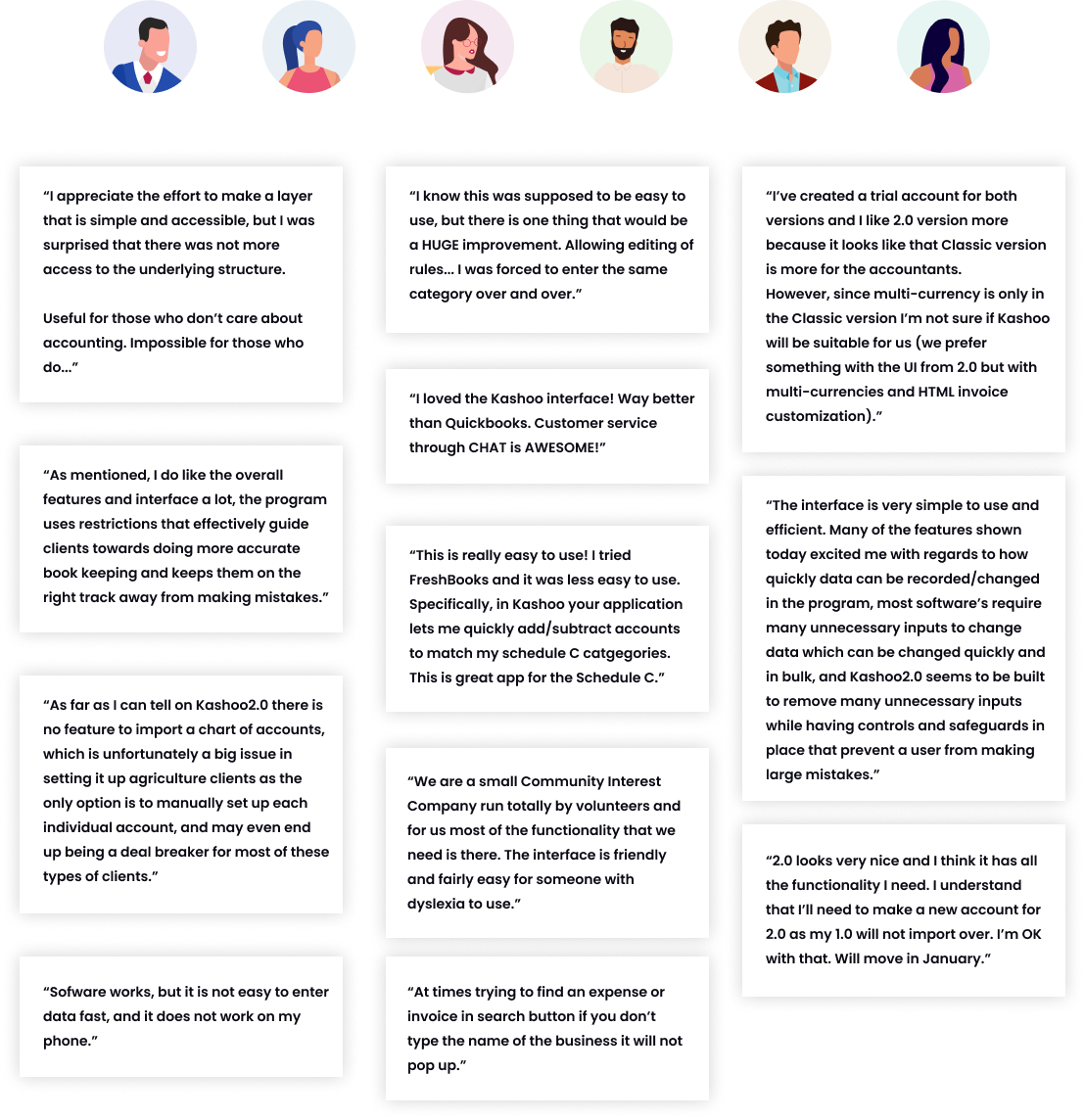
USER FEEDBACK
Feedback on Kashoo 2.0
When we first released Kashoo 2.0, majority of the feedback was positive on the UI, however there were some issues regarding missing features like Invoices and Bills to Pay not being implemented yet. There were also some technical issues that’s out of our capabilities to fix like importing Kashoo Classic businesses to Kashoo 2.0, supporting multi-currencies, and bank connections.
As we are getting more and more feedback, the team and I are continuously adding new features and improvements for future releases.
Let's Connect
Feel free to reach out for collaborations or just a friendly hello ✌️