Mothers Matter Centre
A website experience redesign that refreshes the brand image while highlighting and sharing the stories of empowered mothers.
Role
Digital Designer
Methods
Web design
Branding
Visual design
Wireframing
Tools
Wordpress
CSS
Sketch
Photoshop
overview
Putting focus on
The Mission
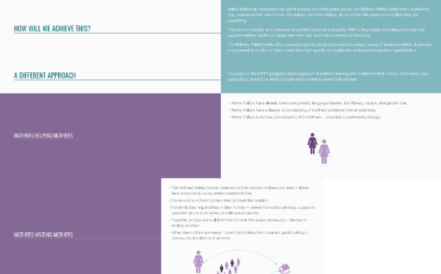
The Mothers Matter Centre empowers isolated mothers by helping them develop the skills and knowledge they need to become more confident parents and engaged citizens in the community.
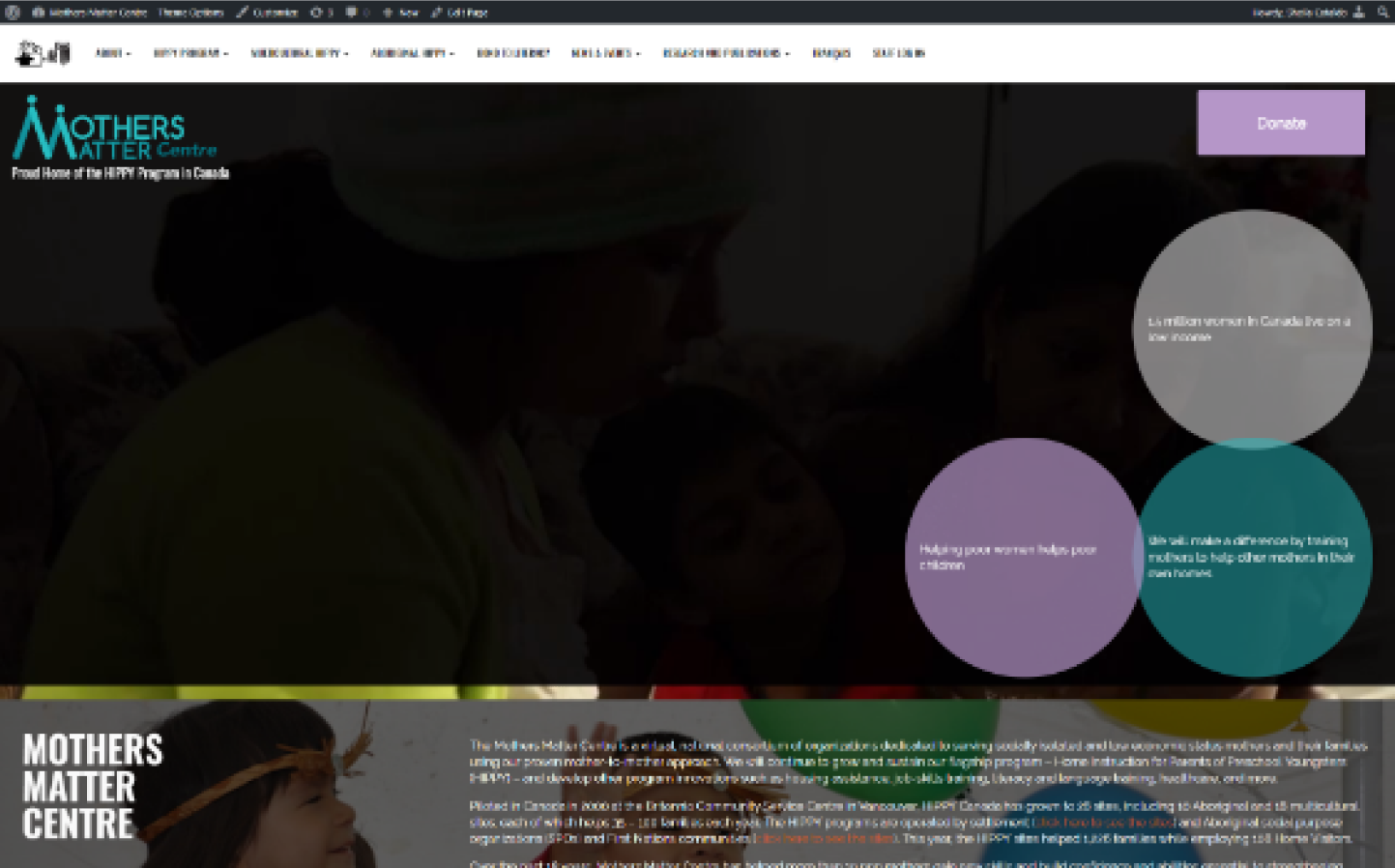
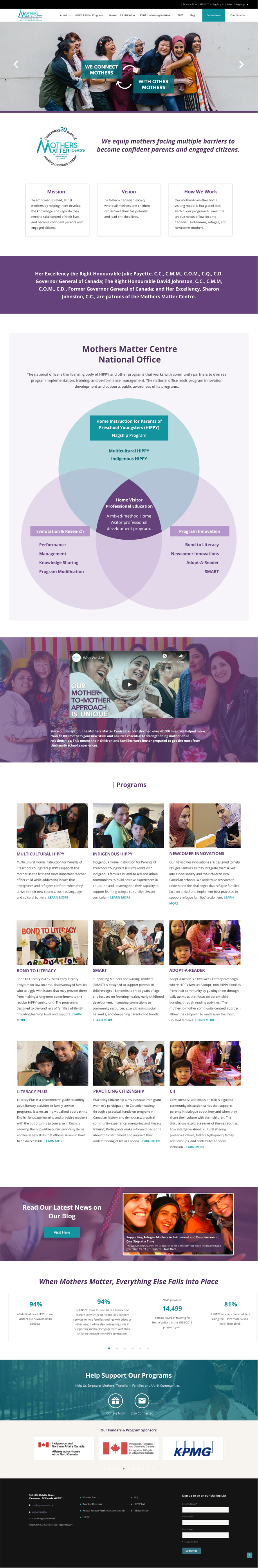
The problem with the old Mothers Matter Centre website was very content heavy, no focus on the MMC mission and did not appeal to look professional.
my role
As the sole-designer at the organization, I created the mockups through Sketch. After iterations and approval from the team & CEO, I developed and launched the final site with Wordpress and custom CSS.
Issues before
the redesign
- Unclear of what the Mothers Matter Centre is about
- Very content heavy
- Not color-accessible (white text on light coloured blocks)
- Many of the content weren’t aligned
- Video on the homepage would not load at times which was also the first element that loaded on the page
- Colours on the site unrelated to the MMC branding
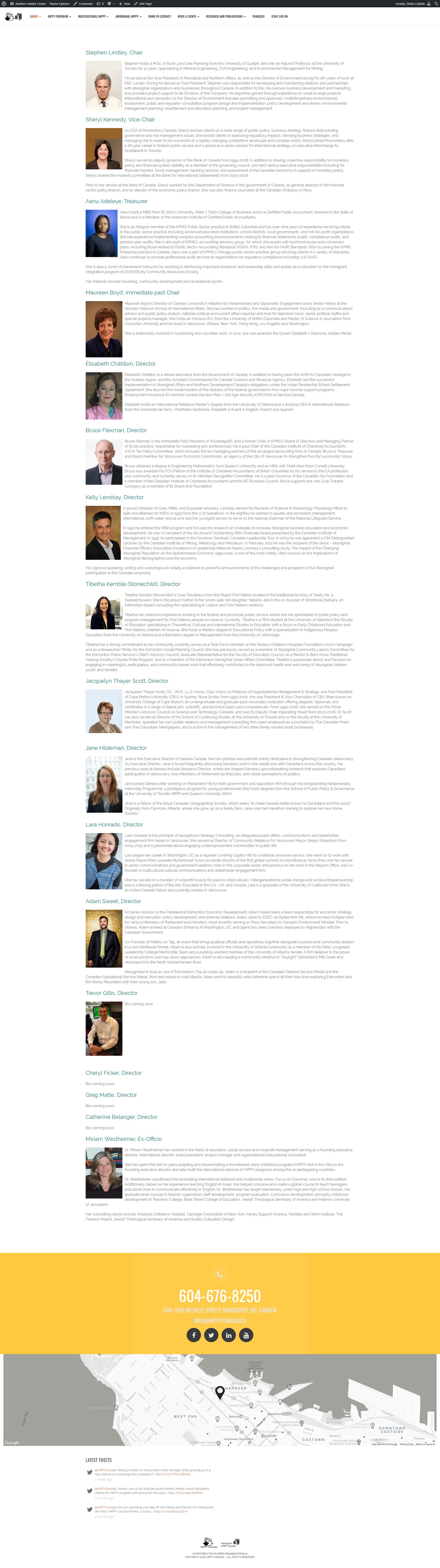
- The Board of Directors being the most hit page of the site, it was not visually appealing and images were old.
- Users tend to get lost or not know how to get to a certain page.
- Donation button not obvious nor did users notice it on the homepage
process
Requirements for
the new website
- Unclear of what the Mothers Matter Centre is about
- All content on the current site needs to be on the new design
- Website should load at a fast speed (which requires small photo sizes).
- Website should be responsive.
- The donation page needs to be embedded into the new site and not make the users be directed to the CanadaHelps page.
- All photos should be of high-quality. Staff and Board members need a reshoot.
I, along with the Communications team started off by reorganizing and restructuring the navigation bar of the homepage. This was the main task to focus one because it helped lay out the structure and flow of how and which pages would be nested in which section.
Simultaneously, I began iterating on ideas through sketches and wireframes of the main page. After countless feedback from the company/team, I designed mock-ups of the main page with Sketch. When the main page design was approved, I began to start building the site based on the mockups. The rest of the pages went through as similar flow, however the feedback were more lenient since the main page was the most important and would be the “first impression” to the viewer.
Brainstorming session
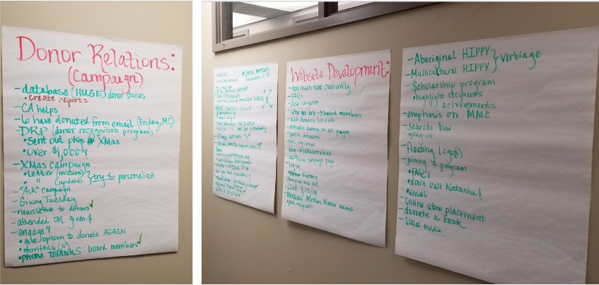
In order to make sure the redesign of the website meets the needs of all the departments of the organization, we had a company meeting to get feedback from all the staff of what they believe should be kept or added on to the new site.
Sketches
A few sketches of how I would be laying out the site.
Initial wireframes of the navigation
Narrowing down the navigation bars to decide the “best fit” for the website. The ones with the red dots were the ones that the team and I had decided upon.
Branding
Colour
Old colour palette

The problem with the colours were that there was no clear hierarchy in which colour to use and when to use them. Also, as you see in the main page, there were times when an orange-y brown colour and yellow were added in even though it’s not part of the colour palette.
Revised colour palette

For the revise palette, I kept with the turquoise and purple as they are the colours within the the Mothers Matter Centre logo. However, I put emphasis on the 2 darker colours being the main colours being used on the site. The lighter hues of the main colours are mainly used as accents so the site isn’t as plain. I removed the Yellow + Maroon colour as they did not fit with the branding.
Also as you may notice it the homepage, the purple and green alternate with a gap of white inbetween; this is for the website to separate the inner sections as well as making it more dynamic rather than bland.
Colour
Old fonts styles
Text & Headers
Raleway - bold
Ralway - regular
Headers
Oswald-bold
Revised font style
All
Open sans
With the old site, the fonts were all mixed different pages which page each page incoherent with each other. For example, in a few pages Raleway was used as the header with different weights but at times Oswald would be used. Also, personally I didn’t think the font pairing suited one another.
For the redesign, I ended up using only Opens sans but with different font-weight. This will make the entire site consistent as well as reduce confusion for any future staff that makes tweaks to the site.
Final Product
what i learnt
Takeaway
This was my first time building a site on Wordpress alone, I'm proud of how much I had accomplished in 2.5 months; I was able to create the designs from sketches to mockups then build it entirely with little to not assitance. There was a lot of self-learning, self-discipline and time management. I learnt to deal with ambiguity and to leverage it rather than being overwhelmed by it. After building this entire site (even though it’s from Wordpress), I have a lot of respect and empathy to developers as it’s very hard to get all the details from design as expected.
Few Screens of the Old vs Redesign
slide left/right to compare
Homepage
(before/after)
Board of Directors
(before/after)
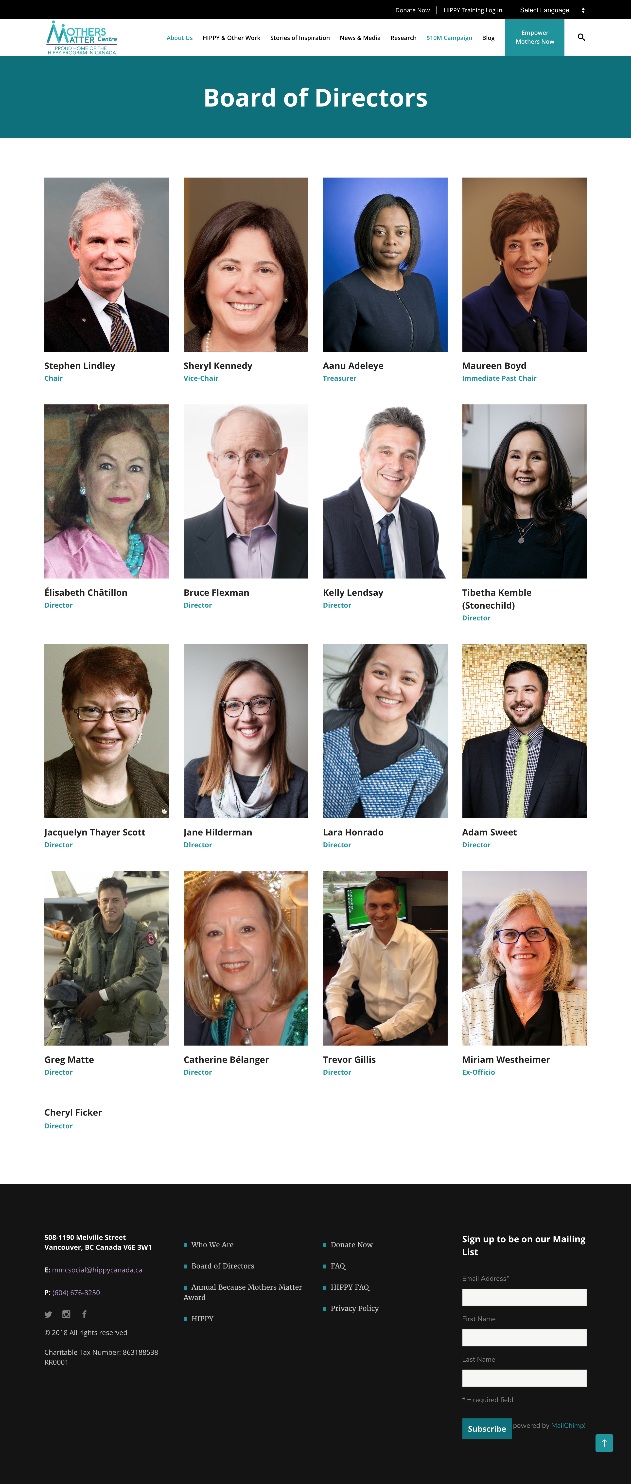
FAQ
(before/after)
Home Instruction for Parents of Preschool Youngsters (HIPPY)
(before/after)
Aboriginal HIPPY
(before/after)
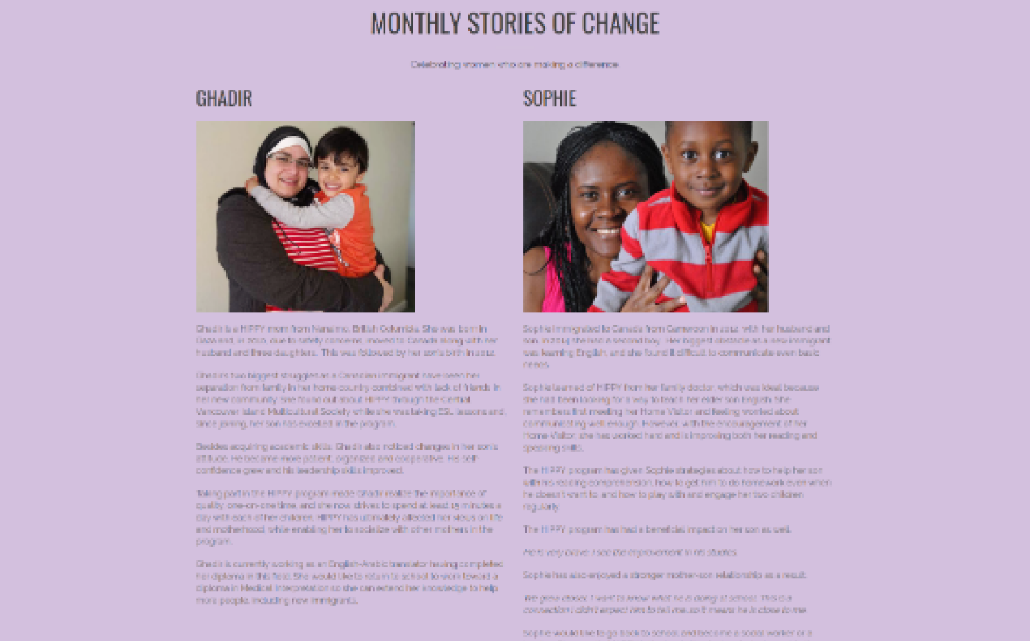
Stories of Inspiration
(before/after)
Let's Connect
Feel free to reach out for collaborations or just a friendly hello ✌️